For easy understanding the variations in data. After the collection and tabulation of data, it can be represented by a graph. Most common graphs are
- Bar graphs
- Pie graphs
- Line graphs
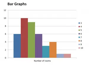
Bar Graph
Bar graph represents the relation between class interval/group and frequency of that particular class interval.
- Along x-axis is the class distribution and along y-axis is the number of times same event repeats and it is named as frequency of that class/group.
Pie Graph
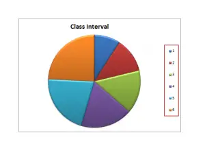
It is a circular chart that is divided into a number of sectors. For representing data in a pie graph, circle is divided into sectors.
Example
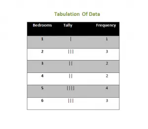
The number of bedrooms on each floor of a 15 storey building is given as:
1 2 4 3 2 5 6 5 4 5 2 5 6 6 3
Solution
For pie graph presentation, divide 360 degrees by 15. Because 360 is an angle of a full circle.
360/15 = 24 degrees
- For 1-bedroom sector = 1*24 = 24 degrees
- For 2-bedrooms sector = 3*24 = 72 degrees
- For 3-bedrooms sector = 2*24 = 48 degrees
- For 4-bedrooms sector = 2*24 =48 degrees
- For 5-bedrooms sector =4*24 =96 degrees
- For 6-bedrooms sector = 3*24 =72 degrees
- By adding all the sector angle = 360 degrees
Graphically…
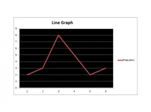
Line Graph
The simplest type of graphs is the line graph. Most commonly used when given data is in the form of grouped frequency.
Along x-axis is the group number and along y-axis is the frequency with respect to each separate group.


Hey There. I found your blog the use of msn. That is a really well written article. I will be sure to bookmark it and come back to learn extra of your useful information. Thank you for the post. I’ll definitely return.
Thanks a bunch for sharing this with all people you actually realize what you are talking about! Bookmarked. Please additionally consult with my site =). We could have a hyperlink exchange arrangement between us